
|
|
SUBSIM: The Web's #1 resource for all submarine & naval simulations since 1997
|
SUBSIM: The Web's #1 resource for all submarine & naval simulations since 1997 |
 03-21-07, 03:49 PM
|
#1 |
|
Captain of the Nautilus
Join Date: Mar 2005
Posts: 146
Downloads: 223
Uploads: 0
|
  You might say "But, Sheppard, the SH4 UI is better, it's less space taken up!" Sure, but a lot of that is simply wasted by the STUPID STUPID report log. Rather than being in a fixed location at the bottom of the screen, it's a floating log; which leads to much problems. Sure, you might say "having it at the top of the screen is no problem!" but look what happens when you load the sub status screen:  The damn log is blocking the buttons, and in order to access them, you have to click and then drag the log away from the buttons! So what if we move that damn log towards the left so that we can free up the buttons?  Why now, it's blocking the TDC controls!  It's not just the log as well. Quite a lot of real estate space is taken up by the "tools" on the nav map  While having the names of nautical land marks on the map are a nice improvement, way way too much space is taken up by the damn tools when SH3 allowed you to use the tools as well, while retaining more screen space for the map  The periscope also suffers from bad design. You know, that's quite a lot of black......nothingness, and is not very immersive, and having the tabs in and out is stupid; exactly what kind of screen real estate are we saving? The Great Yawning Blackness? 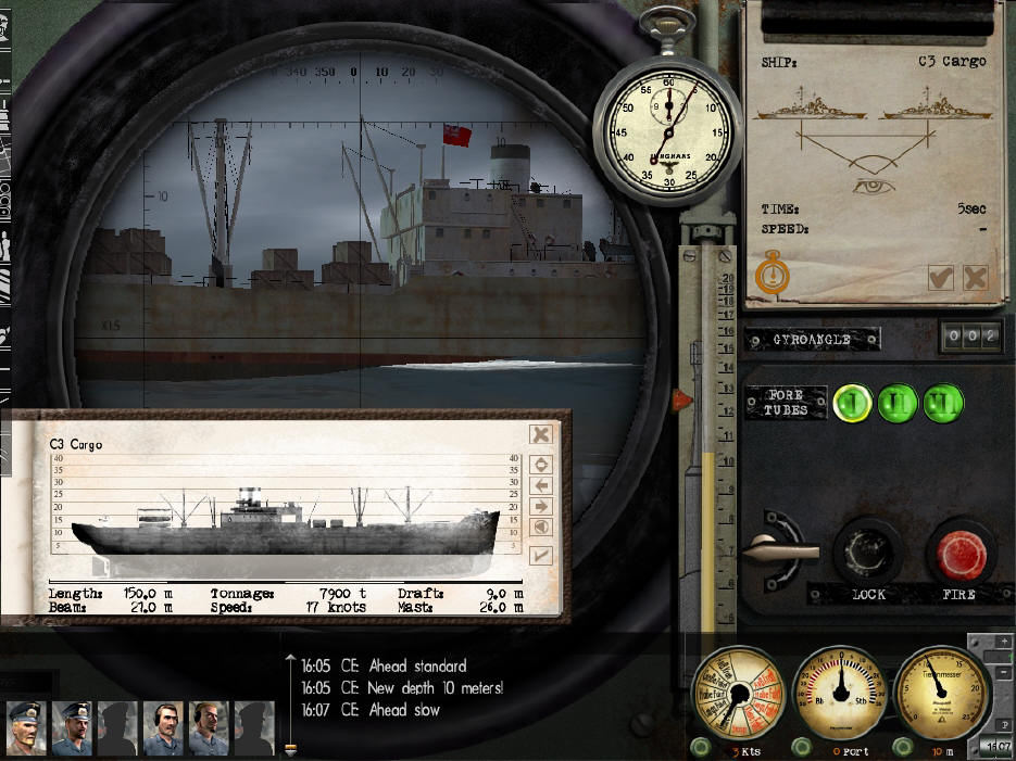 Back to SH3 UI! 
Last edited by Sheppard; 03-21-07 at 04:04 PM. |

|

|
|
|


 Threaded Mode