
|
|
SUBSIM: The Web's #1 resource for all submarine & naval simulations since 1997
|
SUBSIM: The Web's #1 resource for all submarine & naval simulations since 1997 |
 03-18-10, 07:10 PM
|
#46 |
|
Ace of the Deep
 Join Date: Dec 2005
Location: Canada
Posts: 1,124
Downloads: 110
Uploads: 0
|
Just amazing stuff. From sh3: "keep up the good work"

__________________
|

|

|
|
03-18-10, 07:15 PM
|
#47 | |
|
sim2reality
 Join Date: Jun 2007
Location: AM 82
Posts: 2,280
Downloads: 258
Uploads: 30
|
Quote:
 Ha ha... Also sent them by Email, may be quicker. 
|
|
|
|
|
|
03-18-10, 07:35 PM
|
#48 | |
|
Officer
 Join Date: Mar 2007
Location: UK
Posts: 246
Downloads: 0
Uploads: 0
|
Quote:
@Darkwraith. I can't find it at the moment but someone here has already shown the heading "digital" slider set in a correctly styled background. |
|
|
|
|
|
03-18-10, 07:37 PM
|
#49 |
|
sim2reality
Join Date: Jun 2007
Location: AM 82
Posts: 2,280
Downloads: 258
Uploads: 30
|
Have been doing some mockups to decide if i'll start or not.
Anyway here's what i've got so far. (Will update in this thread: http://www.subsim.com/radioroom/showthread.php?t=165377) Not so mush the modern but the retro look:  First Concept old type Torpedo Depth Dial:  Second Concept new type Torpedo Depth Dial: 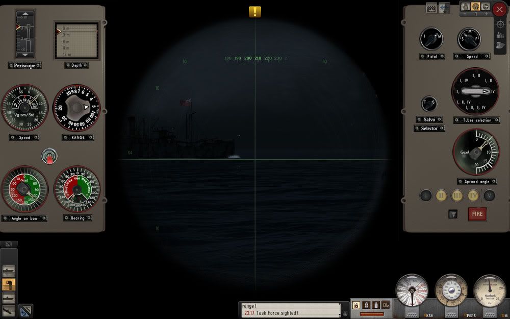
|
|
|
|
|
03-18-10, 08:25 PM
|
#50 |
|
Silent Hunter
 Join Date: Aug 2006
Posts: 3,528
Downloads: 118
Uploads: 0
|
That looks nice, but it's a ton of screenspace taken up (none left for TAI really). Also it's a lot of space between dials that really doesn't do much. It also seems to disregard the message window being maximized and the XO's interface as well. How are you identifying ships with this UI?
I'm really enjoying DarkWraith's minimial dials TDC as it is now. Anything more than that seems a bit cluttery. *shrug* Just my 2km. |
|
|
|
|
03-18-10, 08:45 PM
|
#51 | |
|
Rear Admiral
 
Join Date: May 2005
Posts: 12,987
Downloads: 67
Uploads: 2
|
Quote:
 Anywho, i just want to reiterate something i said in another thread. The minimalist UI, is a push for more realism in and of itself, by trying to increase visual immersion. I liken it to taking the subtitles off a movie being played in your native language. Ever watch a movie in english with english subtitles? I find that VERY destracting. So IMO the minimalist UI is borne out of a desire to see more of whats going on, and less of the UI. (subtitles) What it really is, it is a push for more immersion, just in a different way that fans of "old reliable" don't seem to understand. Aside from that, its a boatload more accurate then the old UI from SH3/SH4! I'm doing some physics testing on the effects of drag on top speed of a submerged uboat that i could NOT do with the old UI. Im very grateful for the accuracy of the new UI right now. |
|
|
|
|
|
03-18-10, 08:46 PM
|
#52 | |
|
Black Magic
 Join Date: Jun 2007
Posts: 11,962
Downloads: 147
Uploads: 5
|
Quote:
those are nice  And with a little scripting magic they can be made to slide.....that way they can 'hide' when not needed. Could put a lock button on them so that user can lock them hidden or lock them viewed. What about adding some torp door open switches? I can script them to control the torp doors (something I haven't gotten around to do yet - my plate is VERY full at the moment And with a little scripting magic they can be made to slide.....that way they can 'hide' when not needed. Could put a lock button on them so that user can lock them hidden or lock them viewed. What about adding some torp door open switches? I can script them to control the torp doors (something I haven't gotten around to do yet - my plate is VERY full at the moment |
|
|
|
|
|
03-18-10, 08:49 PM
|
#53 |
|
Black Magic
Join Date: Jun 2007
Posts: 11,962
Downloads: 147
Uploads: 5
|
just attached the emergency surface command to the new emergency surface icon on the depth bar I added. Works like a charm
Progress is going well  Next is to work on a rudder that the user can select the degrees like the throttle/speed bar. Next is to work on a rudder that the user can select the degrees like the throttle/speed bar.
|
|
|
|
|
03-18-10, 08:53 PM
|
#54 | |
|
Rear Admiral
Join Date: May 2005
Posts: 12,987
Downloads: 67
Uploads: 2
|
Quote:
Do you really need an orders bar at this point? It looks like you have it all right there as far as commands go. Its also very clean, neat, and professional looking. I'm in love with it. 
|
|
|
|
|
|
03-18-10, 09:30 PM
|
#55 |
|
The Old Man
 Join Date: Apr 2005
Location: New Orleans, LA.
Posts: 1,379
Downloads: 487
Uploads: 11
|
@reaper
Maybe i just hate clutter... but i find this to be ALOT more appealing to my eyes IMO (the version im using): 
|
|
|
|
|
03-18-10, 09:49 PM
|
#56 | |
|
Undetectable
 Join Date: Sep 1999
Location: Colorado
Posts: 1,221
Downloads: 132
Uploads: 0
|
Quote:
|
|
|
|
|
|
03-18-10, 11:51 PM
|
#57 |
|
Commander
 Join Date: Sep 2004
Posts: 462
Downloads: 62
Uploads: 0
|
Gutted, is that your own custom UI?
|
|
|
|
|
03-19-10, 12:33 AM
|
#58 | |
|
Black Magic
Join Date: Jun 2007
Posts: 11,962
Downloads: 147
Uploads: 5
|
Quote:
|
|
|
|
|
|
03-19-10, 12:34 AM
|
#59 | |
|
The Old Man
Join Date: Apr 2005
Location: New Orleans, LA.
Posts: 1,379
Downloads: 487
Uploads: 11
|
Quote:
|
|
|
|
|
|
03-19-10, 12:39 AM
|
#60 |
|
The Old Man
Join Date: Apr 2005
Location: New Orleans, LA.
Posts: 1,379
Downloads: 487
Uploads: 11
|
I'm thinking of editing that white border around the gyro dials. It jumps out at you just a tad too much (especially on a dark night).
I might edit the .dds to make it thinner & red like the other dials. |
|
|
|
 |
|
|


 Linear Mode

