
|
|
SUBSIM: The Web's #1 resource for all submarine & naval simulations since 1997
|
SUBSIM: The Web's #1 resource for all submarine & naval simulations since 1997 |
 09-06-08, 04:00 AM
|
#16 |
|
Chief
 Join Date: Jul 2005
Posts: 316
Downloads: 28
Uploads: 0
|
On normal maps you can find positions of lighthouses (perhaps you could combine your new map texture with sergbutos lighthouse mod?) and buoys. with this information it is easier to navigate through shallow water areas near the ports.
|

|

|
|
09-06-08, 08:14 AM
|
#17 |
|
Ocean Warrior
 Join Date: Jan 2008
Posts: 2,909
Downloads: 77
Uploads: 11
|
Thanks DS and Bosn, I didn't know about the shallower being darker thing, I tried it and it looks pretty good. I've made three sets of colour schemes, one I really hate, but they're not for my use
 . .Thanks everyone else for the feedback, the first one was a bit bright, but some like it over the toned down version. Anyway, here's the set I have at the moment: Original Map Scheme with added terrain detail. For those that don't like any of the following schemes and think original is best:  Map Scheme 1. High contrast map. Light blue for the shallows, dark blue for the deep. 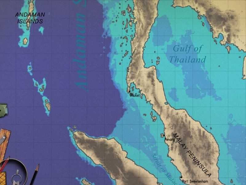 Map Scheme 2. High contrast map. Inverse of previous colours. Dark blue for the shallows, light blue for the deep. 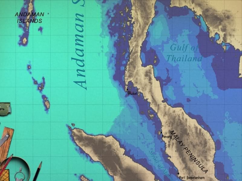 Map Scheme 3. More contrast than stock map. Light blue for shallows, medium blue for deep water. 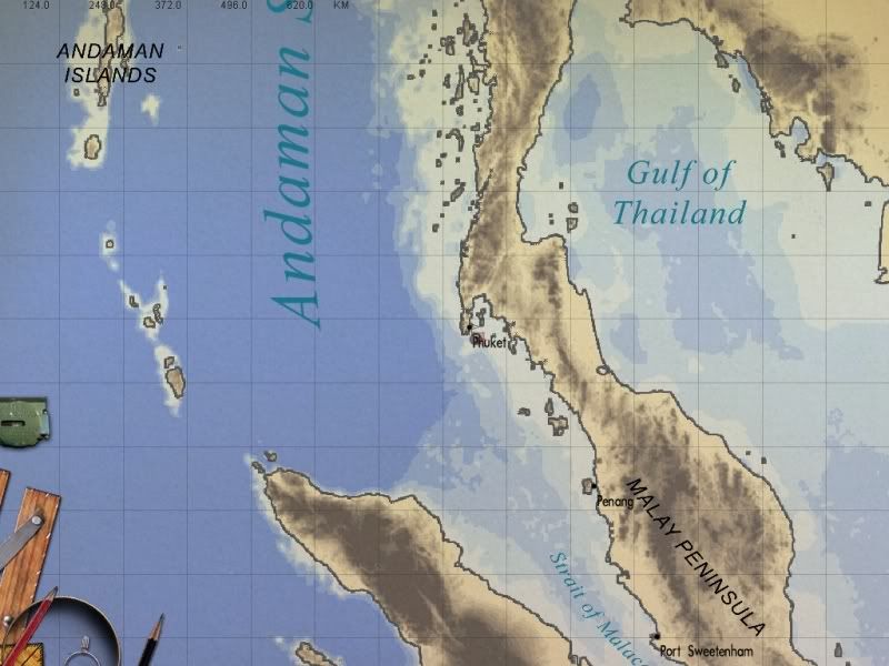 Map Scheme 4. More contrast than stock map. Inverse of previous scheme. Dark blue for shallows, light blue for deep water. 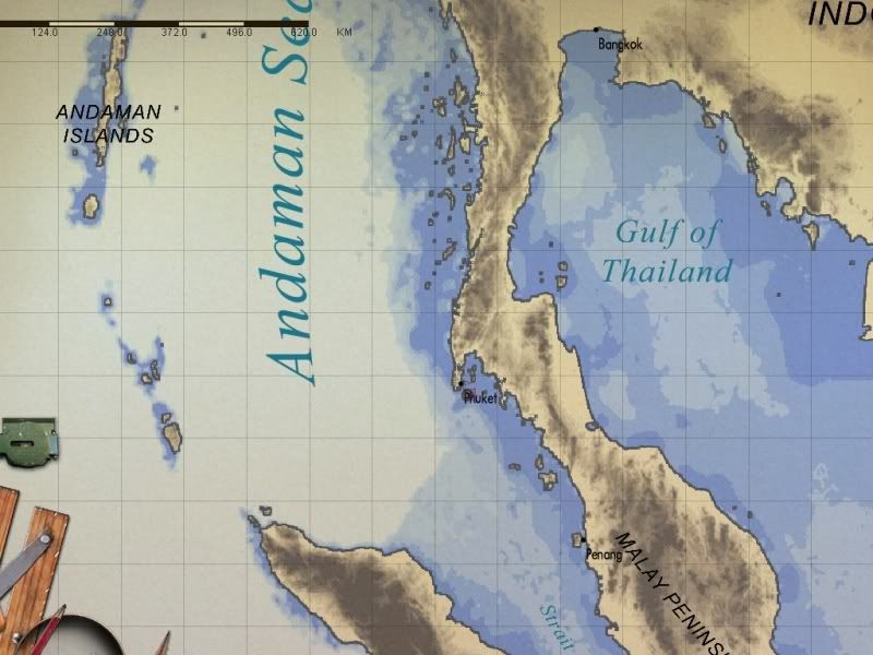 Any more suggestions or colour schemes people would like?
__________________
-------------------------------- This space left intentionally blank. |
|
|
|
|
09-06-08, 09:11 AM
|
#18 |
|
Sea Lord
 Join Date: Aug 2007
Location: Too far from the Pacific right now...
Posts: 1,634
Downloads: 0
Uploads: 0
|
Personally, I like the original with the added land detail.

__________________
RFB / RSRDC Beta Tester RFB / RSRDC Modding Forum: http://forum.kickinbak.com/index.php RFB Top Post link: http://www.subsim.com/radioroom/showthread.php?t=125529 RFB Loadout: RFB_V1.52_102408: RFB_V1.52_Patch_111608: RSRDC_RFBv15_V396 |
|
|
|
|
09-06-08, 10:03 AM
|
#19 |
|
Mate
 Join Date: Jul 2008
Posts: 56
Downloads: 33
Uploads: 0
|
Nisgeis wrote:
> but with points of departure being used to plot departutre > courses at the start of patrol, they must have used maps > of the land that showed elevation as well as the sea depth? Nautical charts generally ignore elevations and terrestrial landmarks, except as they would be used in coastwise navigation (i.e., piloting). Both natural (e.g., mountatin peaks) and man-made features (prominent buildings, radio masts) are commonly found on small-scale charts, but anything not clearly visible from a vessel is simply left off. The stock charts are generally correct in that regard. Adding terrain shading is aesthetically pleasing, but not really historical (or currently) correct. > Anyway, is there any interest in a mod that changes the map's default colours? Making a little more distinction in the bathymetry colors would be useful, especially for folks with vision limitations or not-so-good monitors. I personally would not fundamentally change the stock colors, but would try to increase the contract between them. I like Scheme 3 most. Do not invert the colors -- darker should be deeper; that seems really intuitive to me. |
|
|
|
|
09-06-08, 10:06 AM
|
#20 |
|
Captain
 Join Date: May 2005
Location: Memphis, Tn. U.S.A.
Posts: 548
Downloads: 21
Uploads: 0
|
For me it`s a toss up between the original with land textures, and map 3. I`m an older skipper, and the printed locations are easier to read, especially on the ocean in those colors. Puts
__________________
" Is He?..........Yeah..........Nothing Moving, But His Watch." |
|
|
|
|
09-06-08, 10:12 AM
|
#21 |
|
Captain
Join Date: Jan 2002
Location: Costa Rica
Posts: 527
Downloads: 145
Uploads: 0
|
I think scheme 3, else it would be difficult to follow marcks and plots with the high contrast versions.
we are used to clear being shallow and dark deep and could get confussed with the "negative" versions excellent will this mod affect also the Atlantic??? will it work with the kriesgmarine grid mod? yes, I ask a lot!
__________________
Pacific Thunder Campaing VIII-Retired www.subsowespac.org "Left on their own, engineers can be dangerous" |
|
|
|
|
09-06-08, 10:16 AM
|
#22 |
|
Ocean Warrior
Join Date: Jan 2008
Posts: 2,909
Downloads: 77
Uploads: 11
|
Just to be clear - All of the colour schemes will be available and you'll be able to choose which one you install.
Anyone have any extra requests?
__________________
-------------------------------- This space left intentionally blank. |
|
|
|
|
09-06-08, 10:23 AM
|
#23 |
|
Admiral
 Join Date: Jan 2008
Location: New York State, USA
Posts: 2,390
Downloads: 126
Uploads: 7
|
I like two of them, the original with land detail and #3, but I think the added contrast in 3 gives it my 'vote'. I think one problem with the white for deep, on nighttime missions especially convoys ans taskforces it would take longer for you eyes to adjust after looking at all that white.
Peabody
__________________
System Spec: Gigabyte GA-965P-DS3, PentiumD Dual Core Presler 945 3.4Ghz, Gigabyte Geforce 7600GS, 2-1GB Corsair XMS2 800Mhz in Dual Channel, 2-WD 250 SATA 3Gb/s, Onboard Realtek HD 7.1 Audio, DVD ROM, DVD burner, Hiper 580 Watt Power supply, WinXP SP2. |
|
|
|
|
09-06-08, 10:49 AM
|
#24 | |
|
Ocean Warrior
Join Date: Jan 2008
Posts: 2,909
Downloads: 77
Uploads: 11
|
Quote:
Inverted stock colours with terrain detail. 
__________________
-------------------------------- This space left intentionally blank. |
|
|
|
|
|
09-06-08, 11:51 AM
|
#25 |
|
Stowaway
Posts: n/a
Downloads:
Uploads:
|
Nisgeis,
That last one with the inverted stock colors and terrain detail looks pretty darn close to the real thing! Do these new charts take on a red tint during night lighting? Great work, too bad I am waiting on a video card RMA!! |
|
|
|
09-06-08, 11:56 AM
|
#26 | |
|
Ocean Warrior
Join Date: Jan 2008
Posts: 2,909
Downloads: 77
Uploads: 11
|
Quote:
__________________
-------------------------------- This space left intentionally blank. |
|
|
|
|
|
09-06-08, 12:04 PM
|
#27 |
|
Captain
Join Date: May 2005
Location: Memphis, Tn. U.S.A.
Posts: 548
Downloads: 21
Uploads: 0
|
Nisgeis, That looks good too, very readable, all those should give a variety of map textures that should please any taste. Puts
__________________
" Is He?..........Yeah..........Nothing Moving, But His Watch." |
|
|
|
|
09-06-08, 12:15 PM
|
#28 | |
|
Commodore
 Join Date: Jul 2008
Posts: 611
Downloads: 0
Uploads: 0
|
Quote:
|
|
|
|
|
|
09-06-08, 03:32 PM
|
#29 |
|
Grey Wolf
 Join Date: May 2008
Location: DB85
Posts: 804
Downloads: 166
Uploads: 0
|
Yeah me too. maybe just a little bit of saturation to the ocean.
Good job! Also is there a way to change the fonts? Neither one UBI used looks too historical to me.
__________________
|
|
|
|
|
09-06-08, 03:45 PM
|
#30 | ||
|
Mr. Bad Wolf

Join Date: Aug 2005
Location: Aabenraa, Denmark
Posts: 1,488
Downloads: 47
Uploads: 0
|
Quote:

__________________
  Download my mods from SHMF Follow my photography here taler dansk, speak English, spreche Deutsch, parle français, forstår svenska/norsk, comprendo castellano |
||
|
|
|
 |
|
|


 Linear Mode

