
|
|
SUBSIM: The Web's #1 resource for all submarine & naval simulations since 1997
|
SUBSIM: The Web's #1 resource for all submarine & naval simulations since 1997 |
|
|
 04-13-22, 06:29 PM
|
#1 | |
|
CINC Pacific Fleet
  Join Date: Sep 2003
Location: Denmark
Posts: 20,571
Downloads: 37
Uploads: 0

|
Quote:
Made a search to see if either Humbrol or Revell had a colour near our skin. Here what it says "There is no such thing as a skin color. Skin color is essentially a combination of all 3 primaries: red, yellow and blue. That's right. Red plus yellow plus blue" Markus
__________________
 My little lovely female cat |
|

|

|
|
04-13-22, 06:46 PM
|
#2 |
|
Ocean Warrior
 Join Date: Oct 2017
Posts: 2,652
Downloads: 60
Uploads: 0

|
 If you allow it, "skin tone" will drive you mad. What I try for is an accurate "quick look" color. You see it on the figure, it looks about right, and your attention moves on to other areas. What surprised me was that the worst "flesh tone" paint comes from Tamiya, I call it "electric peach". |
|
|
|
|
04-13-22, 07:17 PM
|
#3 |
|
Born to Run Silent

Join Date: Jan 1997
Location: Cougar Trap, Texas
Posts: 21,385
Downloads: 541
Uploads: 224
|
Not me, I'm going to try to paint some crew members for the Gato when I get tot it but I'm not really confident they will good. I've watched some videos on it and they make it look easy, but again, my dexterity isn't that good. I'm certainly not good at drawing and that seems like the kind of coordination that helps.
__________________
SUBSIM - 26 Years on the Web |

|
|
|
04-13-22, 07:37 PM
|
#4 |
|
Ocean Warrior
Join Date: Oct 2017
Posts: 2,652
Downloads: 60
Uploads: 0
|
In many ways, the smaller scales (1/72nd to even 1/350th) are easier for figure painting.
 Just find a good base color (keeping in mind the basic uniform color) and go for it. After that, maybe use a darker "wash" color to bring out some shadows and you're done. Just find a good base color (keeping in mind the basic uniform color) and go for it. After that, maybe use a darker "wash" color to bring out some shadows and you're done.The key to the smaller scales is "don't try to over do it". Keep it as basic as possible (including the uniforms) or else find a REALLY tiny brush. 
|
|
|
|
|
04-23-22, 08:19 AM
|
#5 |
|
Starte das Auto

Join Date: Aug 2014
Location: The Fens
Posts: 17,482
Downloads: 5
Uploads: 0


|
Here's a 110mm white metal kit from 'Andrea Miniatures' I painted up using a mix of enamel & acrylics
 What you need to know is there should be some blue in your flesh tones. Humbrol 61 and Revell 35 are no good straight from the tin but need the addition of some red (a darkish one) and blue to get a colour that's less jaundiced-looking... then some white to lighten it . More white for a smaller 54mm figure because you want to be thinking about 'scale colour' too I first paint on a base of matt flesh colour, then dampen the dried surface with water to allow a faint dab of a rose red acrylic colour to be softly tickled into the cheek areas using a small brush. The damp surface means you can soften this so it just slightly colours the cheeks up. You can see this in my photo Then I'll use the same method to work a thin grey-brown colour around where facial stubble would be on a soldier who didn't always get time to shave. Also do this on any bare forearms, although a 'scumbling' of grey brown using a 'dry brush technique' (stroking across) makes for the most realistic arm-hair A more general wash of very thin red-brownish acrylic can be useful to bring out any good relief detail such as around the eyes and ears, although this shouldn't be overdone For the lips I use the flesh colour I've already settled on but add a little more blue and red to give a 'plum' colour - but not too dark Eyebrows and pupils I then pick out with a small brush using a thin acrylic brown. And I NEVER ever paint the whites of the eyes; when you're standing a distance from someone you just don't really see these. So many great figures get ruined by 'zombie eyes'. Leave them flesh colour and just stroke in a tiny curved line to describe the upper eyelash line, then a short stroke downwards from this for the pupil... that's all I do
__________________

|
|
|
|
|
04-23-22, 01:51 PM
|
#6 | |
|
Gefallen Engel U-666

Join Date: Jul 2013
Location: On a tilted, overheated, overpopulated spinning mudball on Collision course with Andromeda Galaxy
Posts: 30,087
Downloads: 24
Uploads: 0


|
Quote:
 most certainly in those Stalingrad dioramas! most certainly in those Stalingrad dioramas!  
__________________
"Only two things are infinite; The Universe and human squirrelyness?!! Last edited by Aktungbby; 04-23-22 at 02:01 PM. |
|
|
|
|
|
04-23-22, 11:35 PM
|
#7 |
|
Ocean Warrior
Join Date: Oct 2017
Posts: 2,652
Downloads: 60
Uploads: 0
|
Something you all may want to avoid:
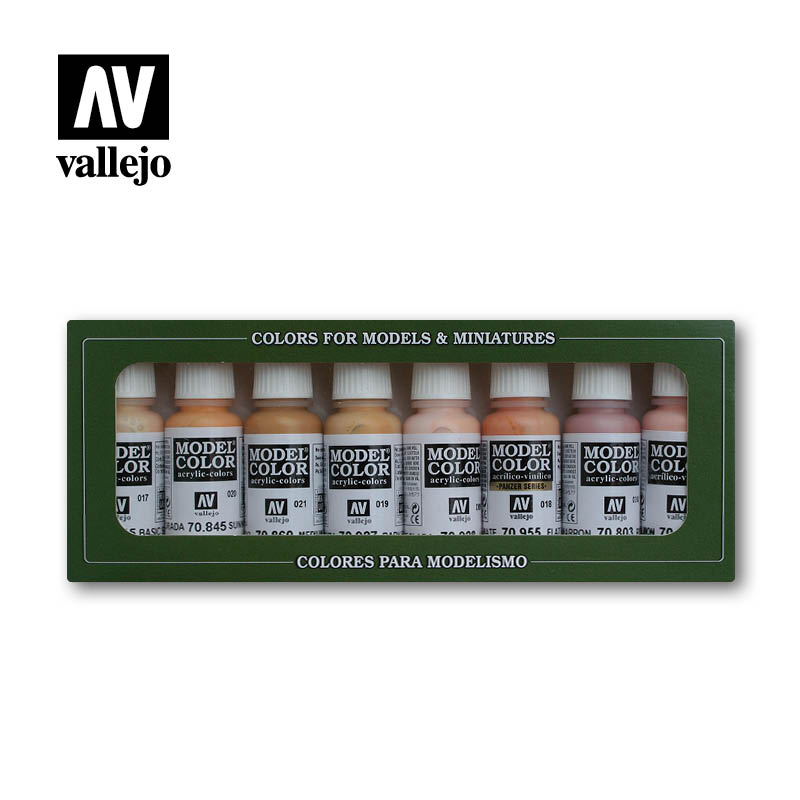 Vallejo Face and Skintones (Art. 70124) I had some high hopes for this (acrylic) paint set but it always seems to "just miss" its target. The paint itself can also be overly delicate and hard to blend with other acrylics, making shading and highlights a frustrating process. |
|
|
|
|
04-24-22, 12:09 AM
|
#8 | |
|
Ocean Warrior
Join Date: Oct 2017
Posts: 2,652
Downloads: 60
Uploads: 0
|
Quote:
 For example, if you were painting a large "bust" type of figure, how would that be different than painting smaller figures? Should you add highlights and shadows at all?  As another example, if you were painting a 1/35th scale diorama of a tank and its crew, should the figures be 'weathered' just like the equipment or should the figures look more 'natural', possibly looking like someone else painted them? These are leading questions and I have my own theories , but I would really like to see what you think.
|
|
|
|
|
|
04-24-22, 04:23 AM
|
#9 |
|
Ocean Warrior
Join Date: Oct 2017
Posts: 2,652
Downloads: 60
Uploads: 0
|
Speaking of figures, check out the first kit Andy reviews:
Its Aktungbby's office from Gray Wolves.  The scale (1/16th) of this kit is going to be weird. With the span of the rotors, the kit will always be one ping pong ball away from disaster. 
|
|
|
|
|
04-27-22, 12:29 PM
|
#10 | |
|
Starte das Auto
Join Date: Aug 2014
Location: The Fens
Posts: 17,482
Downloads: 5
Uploads: 0
|
Quote:
As for figures, I don't dry-brush highlights as this can often be overdone and looks false. However, dry-brushing a lighter colour to imitate weathering is different, plus I do use dark washes to show up relief detail (see the hands and boots on these Airfix US Marines)  Just by the by, for the straps on helmets and guns etc like here, I use the soft metal from collapsible paint tubes or wine bottle necks as it's easy to coax into 'hanging' right
__________________
|
|
|
|
|
 |
| Thread Tools | |
| Display Modes | |
|
|


 Hybrid Mode
