
|
|
SUBSIM: The Web's #1 resource for all submarine & naval simulations since 1997
|
SUBSIM: The Web's #1 resource for all submarine & naval simulations since 1997 |
 05-13-10, 07:41 PM
|
#121 | |
|
Gunner
 Join Date: Jul 2007
Location: Periscope depth 200 yards from your stern!
Posts: 93
Downloads: 84
Uploads: 0
|
Quote:
I like what your going for, but mabey a slightly lighter hint of red, and try to put it on certain areas of scope to make it look like inside lighting. ATM it looks a little off. But your on track. Mabey just fade the red out a little with a more transparent mask? Or if you can edit using photoshop, mabey use "darken" on the red mask. it should keep it shown red on the parts but not in the dark areas. May have to mix and match. Last edited by icecold; 05-13-10 at 07:52 PM. |
|

|

|
|
05-13-10, 07:45 PM
|
#122 |
|
sim2reality
 Join Date: Jun 2007
Location: AM 82
Posts: 2,280
Downloads: 258
Uploads: 30
|
Thanks Wordeee.
Well I've done some more experimenting on the Night Filter as even though it works I don't like the total red washed look across the whole screen. Just didn't convey any depth of perception. So, like most things I'm not happy with in the UI - Redo, redo, redo. Got a better method to achieve the look I want now: 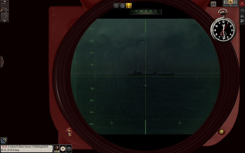 No to do the same for all the rest, but not tonight - time to get some shut eye. 
|
|
|
|
|
05-13-10, 07:48 PM
|
#123 | |
|
sim2reality
Join Date: Jun 2007
Location: AM 82
Posts: 2,280
Downloads: 258
Uploads: 30
|
Quote:
Haha.. Guess I was posting at the same time - something more like above. 
|
|
|
|
|
|
05-13-10, 07:54 PM
|
#124 | |
|
Gunner
Join Date: Jul 2007
Location: Periscope depth 200 yards from your stern!
Posts: 93
Downloads: 84
Uploads: 0
|
Quote:

|
|
|
|
|
|
05-14-10, 03:26 AM
|
#125 |
|
Seasoned Skipper
 Join Date: Jan 2002
Location: Oslo, Norway
Posts: 654
Downloads: 163
Uploads: 0
|
Love your work. 3 things that didn't like that much:
1. Scopes are way to dirty. I had trouble seeing targets. A scope that weathered would have been exchanged immediatly. 2. No TDC in OBS scope. OBS scope were the prefered scope during dark days or night attacks when submerged due to larger head. 3. REC manual. I can hardly read the XO output. Can you change font color to black?... also, how do i close the REC manual? Other than that it's brilliant. It feels and look like WWII and i love the filters This would be a great addon to Darkwraiths UI mod.
__________________
Intel I7-7800x CPU. 16Gb G.skill DDR4 3600MHz. Asrock Taichi X299 mb Palit RTX 2080Ti. Fortron 1000W PSU. BenQ XR3501R LCD. Last edited by Ragtag; 05-14-10 at 03:36 AM. |
|
|
|
|
05-14-10, 03:57 AM
|
#126 |
|
Sailor man
 Join Date: Mar 2008
Posts: 46
Downloads: 58
Uploads: 0
|
I'm aware your still experimenting and all, but I've to say that I like the color on the left side of the scope, it very dark, yet still visible enough to work with. The right side of the scope, is a bit to bright to my taste.
If all panels had more or less the same color tone like the left side of the scope has, that would be great. Very dark, still visible enough to make the impression of being a panel with buttons and dials.  Regarding the (new) red look at night. It's looking promising, itching to try it out to get a better feel of it. Looking forward on a test release  But I'm wondering what a tad darker effect would look like, the more the score ring is gone, blended in to the background the better. When I look at it at first glance its the red ring I see first, followed by the green markings in the center and after several long seconds staring at my screen my eye adjust (block out the reddish ring or some thing) and the image of the scope become more clear and the outlining of a ship become visible. When I compare this (first glance) with the stock game, the center is much brighter in color then every thing else. Making it the first thing you focus on. I know your aiming for a red light effect to add the sense of night time to the game. But I'm wondering if it would not be better to darken the the out lining of the scope even more towards hardly visible and leaving only the panels your can toggle on and of with this reddish glow. From what I read in books, seen first hand on the old boats and seen in movies, if the scope isn't fitted with a rubber/leather like eye piece to block out all surrounding light and leave you with the image of the scope alone to focus on, captains would cover them selfs with a coat or a blanket to (try and) block out all surrounding lights to increase visibility. Seeing your..., well tweaking it all and aiming for a darker HUD I reinstalled the mod to gather some more feedback for you. I'm a bit puzzled about your filters. when I compare them  Left side no filter(?) right side green filter The one with no filter gives me a better outlining of the ship against the background then the one with the green filter. Are the filters having a correct desired effect or is it just for show? So far I didn't find a filter that gave me the impression it boosted visibility. I'm wondering if the rec. manual will also be effected by the night time changes and can be made to look darker. In its current state, I find it way to bright. The Attack Disc is real cool feature, but sadly it replaced my big compass mod :  was quit attached to it. was quit attached to it.I doubt the two of them can be mixed and work side by side, if the can please let me know Color wise, the red outer ring I find to have a cursing effect. Doesn't look good with it. Overall its very bright and hard to use during night attacks. Toning down the colors would improve its use a lot. I hope this feedback is useful to you. Regards, Wildcards |
|
|
|
|
05-14-10, 09:55 AM
|
#127 | ||
|
sim2reality
Join Date: Jun 2007
Location: AM 82
Posts: 2,280
Downloads: 258
Uploads: 30
|
Quote:
Regarding the Rec Man, I need to chase down the cream coloured font as in the styles sheet it showing as black but on screen its cream, wierd. Have redone the paper background for the txt to be more visible, but will do my best to get all txt darker. To close the Rec Manual, you need to click on the Ship name thats ID'ed that gets rid of the ship picture. Then you can see a close button on the top right corner. Quote:
The filters at the moment have about 5% more transpariency but then then have a colour added so that is prob making them just as hard to see through as the original - I will play about with them more to get a better colour/Transparency level with them before next release. Now that I have my method worked out foe the Night Mask its simple enough to work the effect to my liking. (I can even add a black filter on top of the parts that need it - its all so easy to do now) Maybe you could do a mock up of what you think would be a good night look in a picture editior. That will give me a visual idea of what your looking for.  Yes I plan on having masks for all the onscreen object including the Rec Man. Have some done for the chrono and the Pocket clock.  Have you any more info on the Big compass mod? Last edited by reaper7; 05-14-10 at 10:21 AM. |
||
|
|
|
|
05-14-10, 01:48 PM
|
#128 | |
|
Sailor man
Join Date: Mar 2008
Posts: 46
Downloads: 58
Uploads: 0
|
Quote:
Great to hear you have a great amount of control when it comes down to applying filters and have the know how on how to use them code wise I'll try to create some mock ups in Gimp, ones I've figured out how it works, just don't be expecting any Picasso's from me art wise. Basic mspaint is about all I've mastered  Regarding the compass I'm very pleased with Ottos TriRingCompass Mod, its a "big" compass very clear in use, and it allows for easy course changes that are yet accurate and spot on. |
|
|
|
|
|
05-14-10, 02:46 PM
|
#129 |
|
Commodore
 Join Date: Dec 2009
Location: My House
Posts: 608
Downloads: 161
Uploads: 0
|
I finally got my machine to run 1080P
Can i have the download link for the latest version? |
|
|
|
|
05-14-10, 02:59 PM
|
#130 |
|
Sparky
 Join Date: May 2005
Location: Austin, Texas
Posts: 151
Downloads: 142
Uploads: 0
|
Really enjoying this mod and see much potential for the future with your (Reaper) craftmanship.
I'd agree with Ragtag - most especially on the "worn" lens for the attack scope being a little too worn. I can barely see through the scope and would greatly appreciate a "refit"!
__________________
"The people who are the most bigoted are the people who have no convictions at all." G.K. Chesterton |
|
|
|
|
05-14-10, 03:01 PM
|
#131 | ||
|
sim2reality
Join Date: Jun 2007
Location: AM 82
Posts: 2,280
Downloads: 258
Uploads: 30
|
Quote:
 , a quick mock up in MS Paint is fine. Just good to picture other ideas, as I may not always visualise the best way to do things, and am open to ideas. , a quick mock up in MS Paint is fine. Just good to picture other ideas, as I may not always visualise the best way to do things, and am open to ideas.Will look into the compass mod for inclusion. Quote:
Still alot to do before next release. 
|
||
|
|
|
|
05-14-10, 03:13 PM
|
#132 |
|
Seasoned Skipper
Join Date: Jan 2002
Location: Oslo, Norway
Posts: 654
Downloads: 163
Uploads: 0
|
I really love how tidy and minimalistic this mod is or can be at will. The TDC layout and gfx is outstanding. Excellent work. Can't wait to see where this mod ends
__________________
Intel I7-7800x CPU. 16Gb G.skill DDR4 3600MHz. Asrock Taichi X299 mb Palit RTX 2080Ti. Fortron 1000W PSU. BenQ XR3501R LCD. |
|
|
|
|
05-14-10, 03:13 PM
|
#133 |
|
Commodore
Join Date: Dec 2009
Location: My House
Posts: 608
Downloads: 161
Uploads: 0
|
I installed it, but I can't see the XO dialogue and the UI
|
|
|
|
|
05-14-10, 03:15 PM
|
#134 | |
|
Seasoned Skipper
Join Date: Jan 2002
Location: Oslo, Norway
Posts: 654
Downloads: 163
Uploads: 0
|
Quote:
__________________
Intel I7-7800x CPU. 16Gb G.skill DDR4 3600MHz. Asrock Taichi X299 mb Palit RTX 2080Ti. Fortron 1000W PSU. BenQ XR3501R LCD. |
|
|
|
|
|
05-14-10, 03:24 PM
|
#135 | |
|
Commodore
Join Date: Dec 2009
Location: My House
Posts: 608
Downloads: 161
Uploads: 0
|
Quote:
|
|
|
|
|
 |
|
|


 Linear Mode

