Thanks DS and Bosn, I didn't know about the shallower being darker thing, I tried it and it looks pretty good. I've made three sets of colour schemes, one I really hate, but they're not for my use

.
Thanks everyone else for the feedback, the first one was a bit bright, but some like it over the toned down version. Anyway, here's the set I have at the moment:
Original Map Scheme with added terrain detail.
For those that don't like any of the following schemes and think original is best:
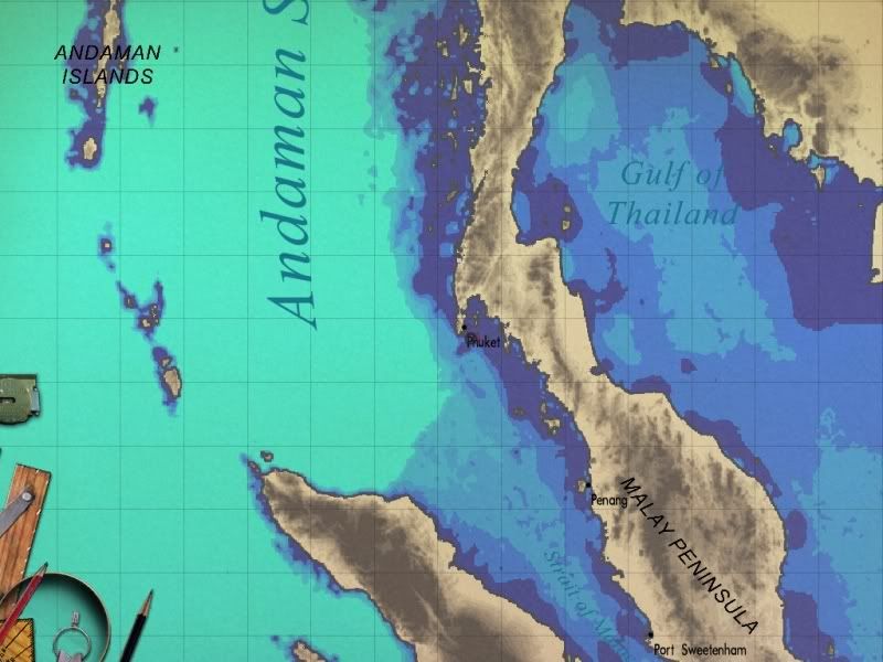
 Map Scheme 1.
High contrast map. Light blue for the shallows, dark blue for the deep.
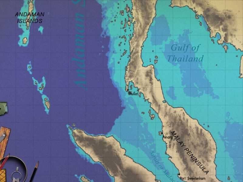 Map Scheme 2.
High contrast map. Inverse of previous colours. Dark blue for the shallows, light blue for the deep.
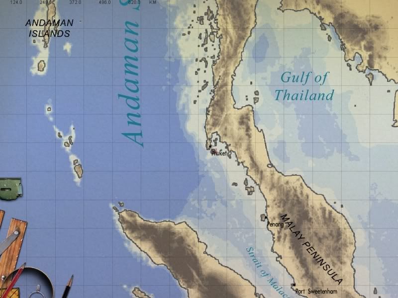
 Map Scheme 3.
More contrast than stock map. Light blue for shallows, medium blue for deep water.
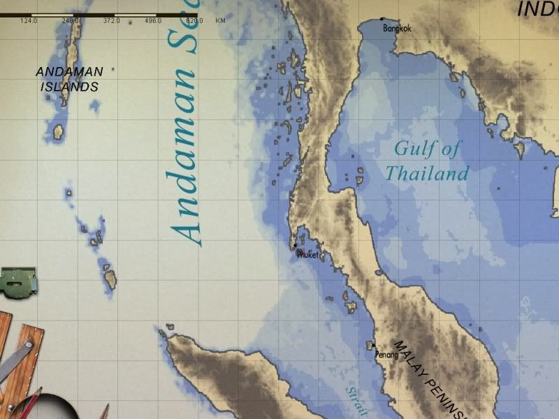
 Map Scheme 4.
More contrast than stock map. Inverse of previous scheme. Dark blue for shallows, light blue for deep water.
Any more suggestions or colour schemes people would like?