Clearer graph set:
 http://nsidc.org/data/seaice_index/n_plot.html
 http://nsidc.org/data/seaice_index/s_plot.html
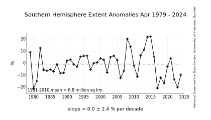
SM's graph refers to the lower data set which shows a upward trend with both the
highest and lowest ice extents in the last 3 years. The trend match is poor.
The exception to this being the Antarctic Peninsula, in the Bellingshausen/Amundsen
and western Weddell seas where the ice is receding.
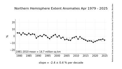
The top graph shows a steady decrease with a better trend match.
Why is the Antarctic growing, but the arctic shrinking?
The most obvious answer is that the Antarctic is surrounded by sea, witch is warming
and producing more snow to fall on the Antarctic, where as the amount of snow in
the Arctic is less influenced by sea temperature because there is less sea around it.
However, that is just informed speculation.