Looking good so far, and I know it's at an early stage, but I spotted a couple of things on it you might want to tweek or add, I've scanned some pics from books I have which might assist you too (see below).
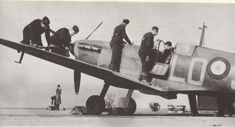
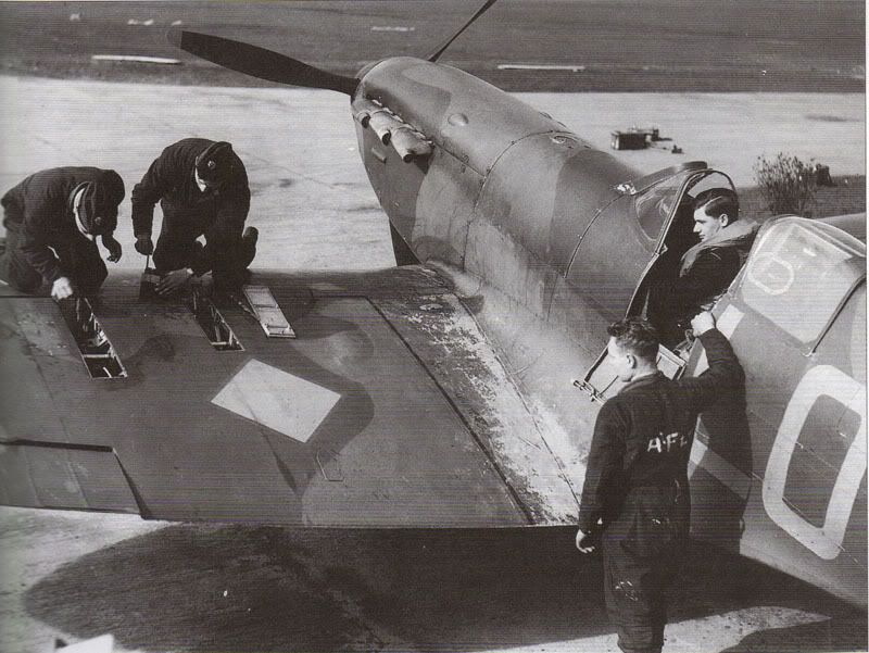
Not a big deal, but the squadron code letters appear to extend deeper onto the wing root fairing in two of my pics, so you might want to change that, it looks like the lettering is over the roundel too. More importantly, your drawing appears to depict the wrong propeller on the aircraft, the two pictures below indicate that 602 Spits (most of which were ordered from Vickers-Armstrongs as a batch of 500 between June and August) were fitted with the DeHavilland prop (a more pointed spinner), rather than the Rotol one (a more bulbous spinner) as in your picture, certainly in the top picture this looks to be the case. Of course most Spitfires eventually ended up getting the Rotol one, so your picture would probably be accurate if it depicts an aircraft from late August 1940 onwards.
I also noticed that the undercarriage oleos appear to be in the under compression position (i.e. on the ground), in truth they don't actually extend much further when the weight is off the wheels, but since it's a drawing and not a photograph, you might want to extend them a smidge to create this impression. Personally, I'd move the pilot a little so he appears to be peering around the nose, if he was coming straight in at the height your sketched-in ground is at, he'd be completely unable to see the airstrip (which is why most taildraggers in that era would fly a curved approach, as you probably know). Then again, he might be just about to turn, so this isn't a big deal either!
The rear navigation light appears to be missing from the rudder too (although I know you might not have sketched that bit in yet).
One last thing, I like the title of your picture, but being 'slow and low' in a Spitfire would be considered a bad approach and any flyer might take that as a bit of an insult!
Feel free to ignore my comments and call me a rivet counter if you like by the way, but since I am also a graphic artist, I know how annoying it is when you've completed some artwork to then spot something you wished you'd changed. So I thought it might help to point this all out while you were still at an early stage in your drawing, which I suspect is going to look really great incidentally, judging by the tone-work on the nose.
Hope you take this all as helpful rather than critical, as that's my intention, and even if you ignore it all, you've still got the pics to check out!
At Drem in (possibly) March 1940
Also at Drem, (definitely) May 1940
The weight off the wheels position on a Mark 1 Spit (although this isn't actually a Mark 1, but similar)
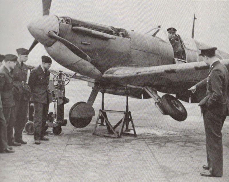

Chock