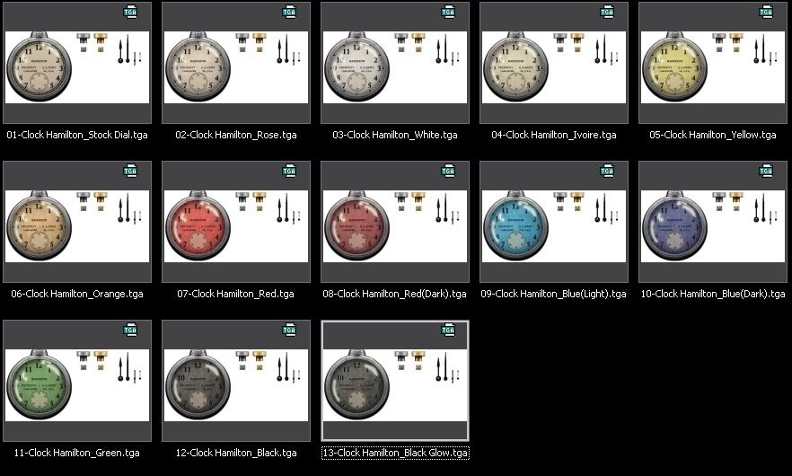
Actually, I have already made a new daytime Hamilton with different colors (some of them not historical at all!!) but the .dds files are not ready at the moment and I still have to modify a few things.
The glare effect will be on, of course with perhaps some variations between watches.
I'll upload the files by the end of next week.
Here's the work in progress (I will probably let down the flashy colors, too much "off style" IMO)
Regarding the fonts, I used the MS Reference Serif, 10pts, + sharp antialiasing effect for the Hamilton line and the MS Serif, 8pts, +antialiasing for the Lancaster line.
They do look fine compared to the original Hamilton dial.
In fact, the final aspect is very sized linked. With a smaller or bigger watch, it doesn't look so good and it's necessary to change fonts and play with the bold and antialiasing effects.
Cheers,
DS