The following is my own analysis on what the stock UI is missing and what is needed to make it complete, therego functional. There are plenty of retro mods, but its my hope that by pointing out whats lacking, someone versed in UI modding might take up the challenge. The minimalist style isn't preferred by all, but for those who prefer it, things are not certainly looking up.
Anyway, if your first foray into SH5 was anything like mine, then you noticed the following was most glaringly absent:
A way to...
- determine heading
- determine or set rudder in degrees to port or starboard.
- set propulsion mode (to recharge battery or not)
- adjust salvo spread
- see torpedo gyro angle
- adjust legs on pattern running torpedos
- access anything resembeling a proper TDC
- determine depth under keel
- report weather
- determine distance to maximum distance at current speed
- return to course
- plot a search pattern
- better control the deck gun, such as fire at will, aiming at water line, etc.
- report nearest visual contacts
- access the gramophone
- acesss the user radio
- report nearest contact, follow nearest ship, etc
Now much of these can and are added back via hotkeys. But everyones hotkey configuration is going to be different, so these things should be accessible regardless of what hotkeys your using, so they should be intergrated into the UI somehow. However, some of these commands could be accessible onto respective and logical crewman who would be handeling some of these things in a real sub. So lets arbitrarily cut this list down.
These should be accessible on the UI, no doubt.
Quote:
- determine heading
- determine or set rudder in degrees to port or starboard.
- set propulsion mode (to recharge battery or not)
- adjust salvo spread
- see torpedo gyro angle
|
While the lack of a proper TDC is noticeable, having one there isn't totally neccessary excepting that we have no way to adjust pattern runners!
Therego go a full on TDC is not only desierable, but neccessary!
Such as the one
illustrated in this post:
Quote:
- adjust legs on pattern running torpedos
- access anything resembeling a proper TDC
|
These should be conversation options on the navigator
Quote:
- determine depth under keel
- report weather
- determine distance to maximum distance at current speed
- return to course
- plot a search pattern
|
These should be conversation options on the watch officer
Quote:
- better control the deck gun, such as fire at will, aiming at water line, etc.
- report nearest visual contacts
|
These should be conversation options on the radio operator
Quote:
- access the gramophone
- acesss the user radio
|
Soundman conversation options obviously
Quote:
|
- report nearest contact, follow nearest ship, etc
|
Im not sure where to adjust the conversation options, and though they differ from the User interface overlay, they can be considered part of the overall user interface with the game. I mention them on this point alone.
Now then, back to the user overlay...
Here's stock in all its unfinished glory:
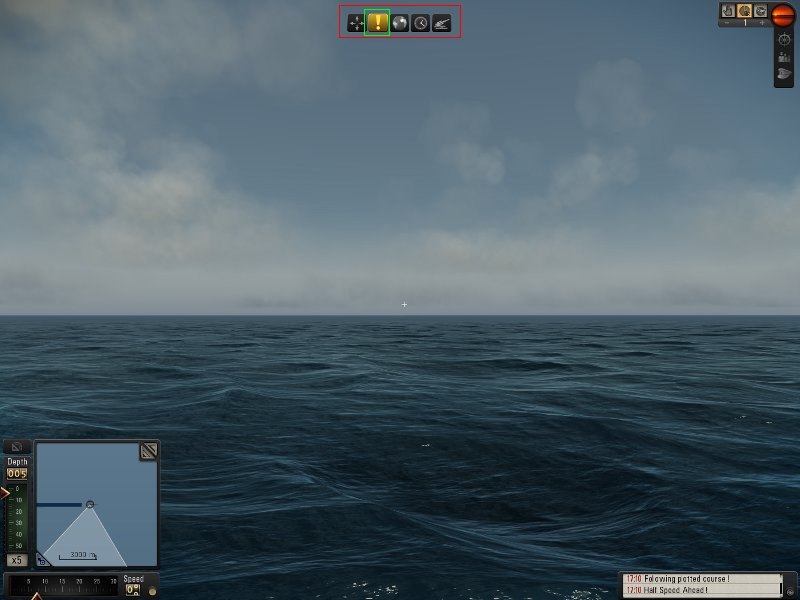 The tutorial icons should probably go.
 The mission icon, is up to personal opinion, id say leave the mission icon, but one could always check their log if they dont remember what they were doing the last time they logged off. (like an MMO. lol)
By way of comparision, thanks to gutted (See his thread
here: ) we have a little more to go on.
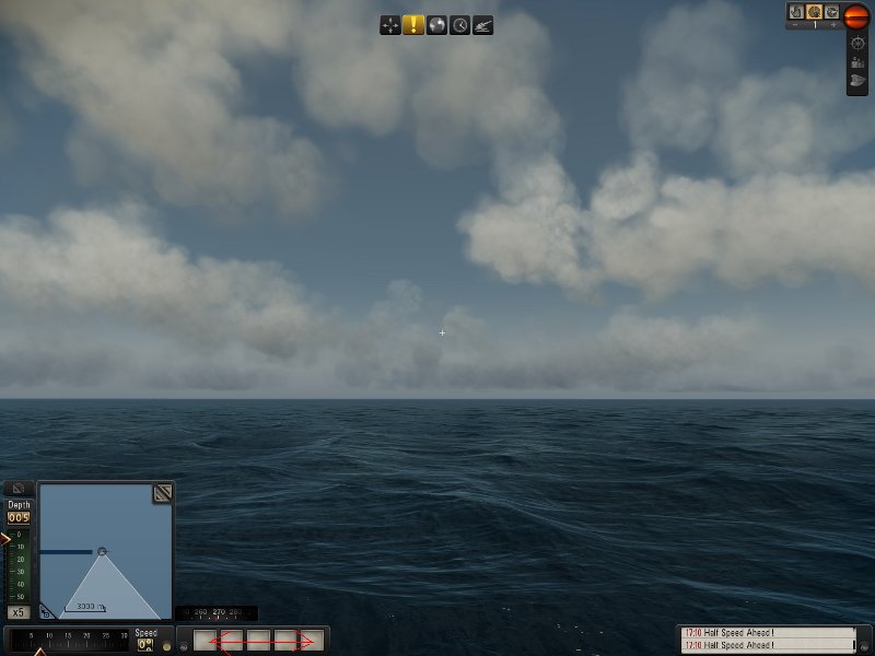
Now we know which way where heading, and look, we have a retractable orders bar. pretty sweet!
But, we still have no way to tell what our rudders doing, and those buttons, while looking pretty spiffy, do nothing. Possible options to make those buttons perform, should probably related to the operation of the uboat, or most used commands for convienance.
examples could be:
- set propulsion/recharge mode
- raise/lower snorkel
- battle stations
- access to TDC screen if it existed
- depth under keel
- return to course
As for the rudder control, it should probably work like the depth control, only on a horizontal bar instead of a verticle one. and ideally be accessed , when one presses the CNTRL button, the compass being replaced by the rudder control, and graduated on a scale of:
( 35 port to 0 midships to 35 starboard)
That out of the way, here's the stock periscope:
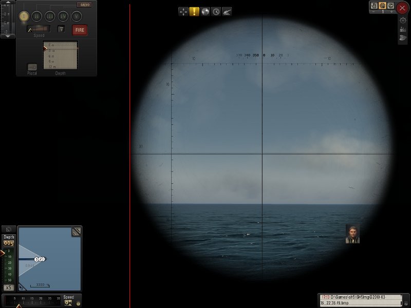
While some users may not like that is offset and not centered, id say its a good thing in disguise. It leaves the entire left portion of the screen to place informational and control items without obscuring the periscope view.
Next screenshot for comparision
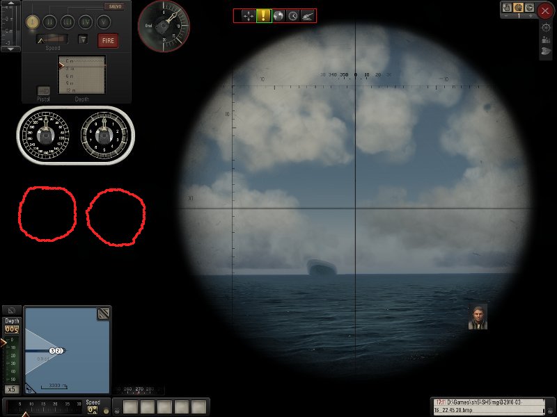
here's an edited version. Layout may vary, but the salvo angle adjustment and gyro angle should most definatly be there in some befitting manner. That leaves the rest of the portion for something else.
Perhaps pattern running torpedo adjustments below the gyro angle when those torpedos are loaded?
here's and edited UZO:

Items of note here:
- centered view causes clutter when neccessary items are added. They should probably be positioned in an orderly manner around the UZO view, or maybe shove the UZO a smiidge to the right so its slighly off centered like the periscope.
- How the orders bar found by gutted looks when retracted.
- the little read square .. ignore that. i was going to illustrate something about rudder commands but lost my train of thought.
Anyway, im outta gas and this post i think got super long. Hopefully it conveys what is lacking and required to make a minimalist UI more functional.
If anyone has something to add that i missed, add it!